


Action Screenshot Competition Winners
|
awesome screens - i hope you will do more of these !
|

|
|
Nice pics, but #1 isnt my fav :/
Última edição por GrimReaperzZ em 24 de jun de 2014 09:41:28
|

|
|
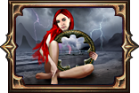
#4: Leaping over Brutus' Blood Slam by Sernak_ (800 points)
I thought that one should have won. |

|
|
nice shots, good reasoning behind the final 5, but...
... but the 4th winner: Leaping over Brutus Blood Slam has failed the criteria having the minimap on... despite that it is a nice screenshot, it should not be in the final 5 just for this. but nevermind looking towards the remarkable ones that did not made it to the final 5 :) Playing for joy ♥
If interested, check out my Hideout(s): /view-thread/2226019 |

|
|
#4 should have won by far.
|

|
|
sorry but #1 and #3 suck. action screenshot? let me attack this necro, take a pic, and send it on? HOLY SHIT IM FIRST PRIZE? WHO UPVOTED THAT?
|

|
" Ok guys good job turning it into a personal attack versus arguing the fact of the matter. I bring proof that the #1 screen shot in fact looks worse then a ps2 game...   Go ahead and take a look at the necromancer again please.. His hair is choppy, His mouth looks messed up, his fingers look distorted and his pants look choppy and over sharpened... I will say that the Templar and his hammer do look pretty good. |

|
" So your complaint is the art for the Necromancer isn't good? The Necromancer looks exactly how it's intended to look. I don't understand what people are complaining about this shot for, it's a really well done screenshot that can be used just as it is for promo's, posters, screen savers. All it needs added to it is a small GGG/PoE logo and it's art worthy. It shows the exact feel of A1N starting out and what every single person just starting in the game can expect to see and feel the first time they enter the fetid pool and fight this boss for the first time. The other shots would need cropping, centering and slight adjustments before they would be ready to be used on any of the things I listed. Does no one remember the first run through this game. Hardly any gear except the white's you've picked up off the ground, if you even picked any up. Maybe you have a couple attacks, more than likely just one at that point, which turns into auto attack 90% of the time because you have no mana left for anything else. The only way this shot would have been better if there were more monsters still alive and being brought back to life around the templar. This shot captures exactly the feel, look and excitement of that first run through the game. It's really well done. “Too often we underestimate the power of a touch, a smile, a kind word, a listening ear, an honest compliment, or the smallest act of caring, all of which have the potential to turn a life around.”
—Leo Buscaglia Contact support@grindinggear.com to report issues relating to the game or forum. Thanks! My beloved pets....  |
|
|
Sorry you all hate my screenshot...
 Remember when I won a screenshot contest and made everyone butt-hurt? Pepperidge Farm remembers.
|

|
|
[Removed]
Última edição por Periphery em 13 de set de 2014 03:32:29
|

|


